The start of the last Earth-shaking week in science now feels like a long time ago…! In the background, though, I’ve had a steadily-growing file on my computer since then called “If Human Made of Sun“, inspired by the birthday of Dmitri Mendeleev. He’s the person who noticed patterns of common behaviour among certain substances that led him to create the Periodic Table of the elements. And his chart has been a fixture on the wall of every school science room for most of the rest of history, with good reason.
As part of the twitterness inspired by that anniversary, @JohnRMoffitt tweeted a chart showing “What Dave is Made of”:

Happy birthday #DmitriMendeleev He would’ve loved to see this chart of rough size & mass of each element in a human. pic.twitter.com/PJHstPlNtu
— John Moffitt (@JohnRMoffitt) February 8, 2016
“How nice that someone’s broken me down by element”, I thought. “If I ever get atomised in a futuristic sci-fi battle, here’s the recipe for the ensuing mess.” The chart shows how much of each element there is in ‘a Dave’ weighing 70 kg *coughs at underestimate*, listed in decreasing order of mass, and it’s pretty cool! You get to see what ingredients it takes to build a functioning human body! The data were data tabulated by Ed Uthman, who got them in turn from John Emsley’s The Elements, though I think the graphic might be due to @Arg362.
Anyway, it turns out the graphic wasn’t personalised: it’s for the average human mass. I suspect they’re using “Dave” as a generic, everyman kind of name (although: this may change soon – expect TV channels called “Ethan”,’”Josh”’ or “Mason” in a few years’ time).
Looking at the leaderboard, I was a little surprised that oxygen was the winner. Since we’re mostly made of water (H20), you might think there’d be twice as many hydrogen atoms for every one of oxygen. But then, oxygen weighs 16 times as much as hydrogen – so it wins out in the end.
Mendeleev’s periodic table arises because of patterns in how electrons arrange themselves in different elements. Some of those electron patterns repeat (or “are periodic”) as you increases the number of protons in the nucleus. While I’m not a chemist or material scientist, that fact is of enormous use to people like me who use atomic spectroscopy to understand what’s going on in the universe, and what various objects are made up of. Similarities between certain elements help us to decode distinct colours in the visible and invisible spectrum of light, and that lets us work out what element gives off that colour. For example, yellow street lights contain sodium: it’s what lets them be a very specific yellow.
One of the things I liked about the chart above was that it showed how much of each element there was, not just in mass but in size… So I started wondering what would happen if you did the same thing with the Sun? If I could survive getting to the surface of the Sun, scooping up 70kg of it into a bag, and then bringing it back to Earth…
In space exploration, this is known as “sample return”: you bring a chunk of something back to the lab on Earth, where we can use all the world’s most advanced tools (or sometimes just a fancy hammer) to investigate what it’s made of. The Apollo astronauts brought back 382 kg(!) of Moon rocks to analyse in this way, and Hayabusa/Hayabusa-2 did/will return samples from an asteroid.
Since 70 kg of “solar stuff” is about the weight of an adult human, I’m going to call it a solar human. If it helps your imagination, you could reshape that plasma in your mind into a lovely, glowing mannequin shape. You can even give them a name, if you like. (I’ll silently judge you if you don’t.)
What would our solar human be made up of? And if you could separate those elements out, how much space would each one take up in your hand? Well, fortunately, the Sun shines a lot of light our way, which we can use to make a spectrum that tells us a) what it’s ingredients are, and b) how much there is of each one.
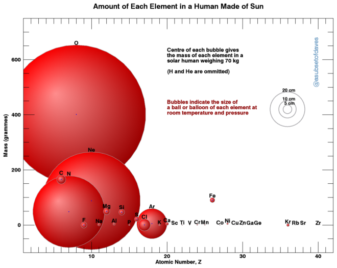
The centre of each bubble shows you how much material is in 70 kg of Sun, and right away you can see that oxygen is again a heavy hitter. This mightn’t be too much of a surprise when you consider that we’re made up of stuff that’s found on Earth, and the Earth and the Sun came from the same original cloud of gas and dust, 4.5 billion years ago.
The size of each bubble shows you something different: it shows how much space each element would take up in a lab back on Earth, if we could distill it out of our 70 kg. (For this I assumed room temperature and atmospheric pressure – data for standard atomic weights are taken from NIST, and pure-element densities at atmospheric pressure are from periodictable.com.)
Oxygen again takes up the most space on this chart, filling a balloon about 80 cm across. Carbon is the next most heavy, but it’s a solid at room temperature, and the size of a snooker ball. Then comes a balloon of solar neon (about half a metre wide), followed by about enough solid magnesium to fill a ping-pong ball, roughly a beachball of nitrogen gas, and so on in ever smaller weights…
Comparing these ingredients in a “solar human” with the composition of a real human, you can see the proportions are very different. This is even though we, the planets, and the Sun – the whole frickin’ Solar System, in fact – came out of the same collection of material. And the ratios of these ingredients are different not just for humans and the nearest star: they’re different for the Sun and comets, or between comets and asteroids, or rocky planets (like Earth) versus gas giants like Jupiter… in fact, the balance of the different elements (and the chemicals they form) is one of the most powerful tools we have to work out how things formed in the universe, and where they came from.
Some people might be looking at the graph above and thinking, “wait a second… why are the two most important ingredients in the Sun missing??”
Well, I deliberately left out hydrogen and helium in the first plot because…
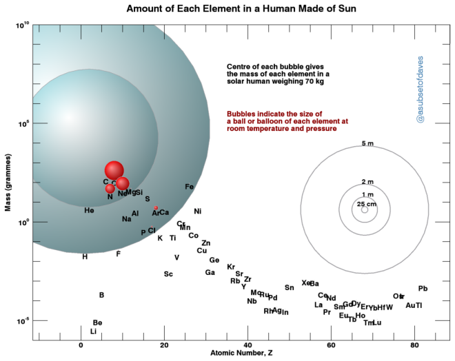
… they completely dwarf everything else! They’re the most abundant elements in the universe, and they’d be by far the biggest in terms of weight and volume. I’m particularly proud that I finally managed to find a scientific reason to draw a helium balloon!
In fact, yesterday (Thursday) was the UN’s International Day of Women and Girls in Science, and @theastroholic marked it with a really nice vlog about Cecilia Payne-Gaposchkin, author of ‘the most brilliant thesis in all of astronomy’, proving that most of the visible universe is hydrogen! The same is true in the Sun: add up helium and all the other bubbles in our second chart, and they still don’t come close to the amount of hydrogen.
Early on in the universe, hydrogen’s dominance was even more true: almost everything (that wasn’t dark matter) was made of it. Hydrogen is like the 1×1 Lego brick atom of the cosmos, but when large stars started appearing, nuclear fusion turned most of the hydrogen inside them into helium (2×2), then some of that into carbon, and later some of that into magnesium and neon. This is why you can see these ingredients featuring higher up in the list: lots of the earliest stars made lots of them. (As carbon-based life-forms should be VERY glad.)
Using the second chart’s logarithmic scale, you can also see that amount of vanadium, cobalt, zinc or gallium in the Sun isn’t actually zero – although the regular first plot might lead you to think that. In both plots, I’ve only included elements which actually have detectable traces in the Sun (data from Table 1 of Asplund et al. (2009)), so those numbers aren’t zero, they’re just very small; there would be just 4 microgrammes of solar lithium, the lightest contributor to our 70 kg sample.)
Although we haven’t yet been able to achieve sample return from the Sun itself, we’ve had a go at it from a great distance. Starting in 2001, NASA’s inspirational Genesis mission spent 28 months holding its aerogel hand out and collecting tiny particles from the solar wind, which is constantly thrown off by the Sun. The idea always reminds me of that gorgeous scene where Wall-E flies through the rings of a planet, touching the grains of dust as they fly past.
The results from Genesis, on the composition of the solar wind, were hugely valuable (and challenging!). In 2½ years’ time, though, we’ll be doing something far more challenging: flying really close to the Sun with the Solar Orbiter mission! This is a radically different way of observing the Sun – it’s far more similar to a planetary-encounter mission than anything we’ve used to observe our star before: think Cassini/Huyghens visiting Saturn, or the Voyager missions (which inspired my interests as a kid). This style of mission means we’ll get closer to the Sun than Mercury, and be able to inspect it up close using telescopes armed with cameras and spectrometers (great news for me). But also – really exciting – we’ll be able to hold Orbiter‘s hands out and catch the particles that make up the solar wind and the Sun’s dramatic eruptions!
In fact, we know that within the material thrown off by the Sun, the balance of the elements it throws off can change, depending on where on the star it comes from. For example, bright active regions, where sunspots live, give off a slower solar wind with a different mixture of elements than the darker coronal holes, where the fastest solar wind roars into space.
But even up close, there’s still quite a distance between where the mission will go and the Sun itself – 40 million kilometres – and not everything leaves the Sun in a straight line. So the only way we can be sure we understand the connection between what Solar Orbiter sees being thrown off the Sun and what it catches with its hands is to see that the balance of the elements is the same in both: and that’s exactly what its 4 hands and 6 telescopes are set up to do!
We’ve already begun to work on the techniques to do this, and once we’ve conquered all the technical challenges to getting up close and personal with the Sun, the data are going to give us an incredible view into how a star interacts with its solar system – including solar systems that harbour life.
Things I learned while doing this
- Oxygen is still the biggest contributor to the mass of the Sun once you knock out hydrogen and helium (helium isn’t kept in the body because it’s a loner and refuses to make any meaningful bonds with anything else. We’ve all met people like helium.) But in a 70kg bag of Sun-stuff, the oxygen only amounts to about 400 grammes, less than 1% what it is in a person.
- I have never known, nor do I now know, all the element names, never mind their names AND symbols… This did not make me feel big or clever as a scientist 😭
- Everyone only cares about the elements that they use in their science. NONE of my usual or Google-able sources listed all the elements in order of nuclear mass, even when they could just put a zero beside the ones that don’t appear 😅
- Related: people seem to list things for people to read, not for computers to read in. I spent most of my time looking into this tabulating or reformatting data, and writing new functions to read them in. I can’t wait until computer-readable tables are mandatory, in science publishing at least.
- Most solar and stellar databases I could find stop caring pretty much at Fe (Z = 26).
- “Hafnium” is a very satisfying word to say 🙂
- I never knew there were so many spoof periodic tables out there, like figures of speech, operators in IDL, swearing, beer styles, typefaces, and even social issues.
- Working out the abundances of the different chemicals in the Sun is REALLY HARD, and is basically a craft in itself. Read the review by Asplund et al. (2009) if you’d like to get a feeling for how much technical skill is involved.
- Selenium has not been detected in the Sun (I find this poetically very pleasing 🙂)
- Someone is going to have to teach me how to say “praseodymium” (I’m looking at you, @jamiebgall & @funsizesuze).
- Every time I see the word “strontium”, I immediately think “Dog” afterwards
- I can’t wait to learn Python properly. Python cares about physical units. IDL just pretends it does and then breaks your effing heart 💔
- I look forward to one day including Lemmium on this chart, even though the value will be 0 µg of human and/or Sun 😊
Solar Orbiter is a European Space Agency (ESA) mission, in collaboration with NASA, scheduled for launch in October 2018.

